| | - To compare a single category of data with respect to a certain variable.
- Example: Change in GDP with time.
- Can be used to represent both numerical as well as categorical data.
|
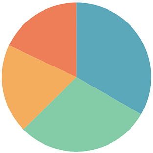
| | - To determine the composition of a variable in categorical data.
- Example: To determine the constitution of air in the atmosphere.
- To compare various categories within a single set of data
- Example: To compare various areas of growth within a business.
- Recommended to use when you have only one set of data with different features.
|
| | - Similar to and roughly based on Line Charts
- To display quantitative data.
- To compare two or more quantities in numerical data.
- To depict a time-series relationship.
- Example: Variation in revenue from sales during each quarter in a financial year
|
| | - Represent continuous variable.
- To display the variation in a particular variable over a given time duration.
- Example: Variation in the stock market index during one trading day.
|
| | - To represent hierarchical data in a tree-like structure in the form of nested rectangles.
- The varying size and color of rectangles are proportional to the data values represented by them.
- Example: The representation of the population of countries in the European Union.
|
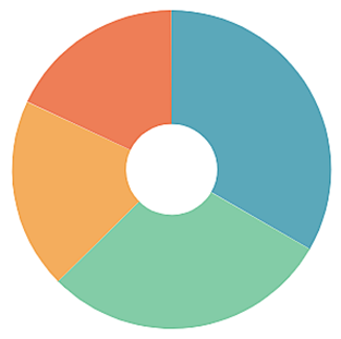
| | - Variation of the Pie Chart
- To represent a part-to-whole relationship between various components of a variable.
- Example: The representation of expenditure by government on various liabilities.
|
| | - Also called the Tag Cloud or Weighted Data Chart.
- To represent textual data visually.
- The size of each word represents its frequency or the magnitude of the variable associated with it.
- Example: The representation of various US cities based on the average sales of cars in the financial year.
|
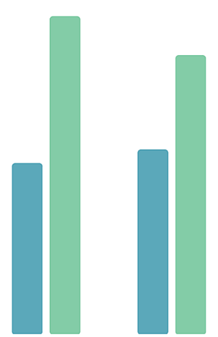
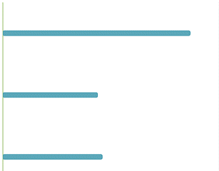
| | - Similar to Column Chart but plotted horizontally.
- To represent categorical data.
- Rectangular bars of heights and lengths proportional to the values they represent.
- Example: Gold medal tally of various nations in Olympic games.
|
| | - To show the distribution of measure values.
- To identify data issues, including outliers.
- To determine the center, spread, skewness, and multiple models in a dataset.
- To determine the relative frequency of occurrence of an event.
- Quantitative data is plotted with data range grouped into bins or intervals. Each column indicates a bin.
- The characteristic of a bin is its area and not its height.
- Example: The representation of time spent by customers in various departments in a departmental store.
|
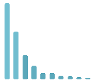
| | - To highlight the most important factor among the given set of factors
- One of the basic tools in quality control
- Bars in descending order represent individual values of the variable, while the exponential curve indicates the cumulative total.
- Example: The representation of most common sources of consumer complaints related to a product or service given by a company
|
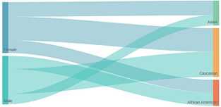
| | - To represent the flow of variables from one set of values to another.
- To draw many-to-many mapping between two domains.
- Example: The representation of the student flow from Asian countries to US universities for various majors.
|
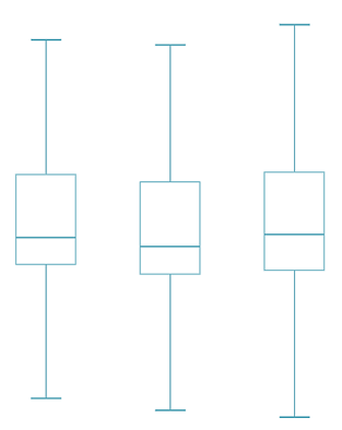
| | - To depict the groups of numerical data through their quartiles.
- To represent how values in a dataset are spread out.
- Provides a graphical summary of the distribution of a sample.
- Whiskers on the two sides of the box represent the variability outside the quartile range and the presence of outliers.
- Example: The representation of the stocks/shares held by different organizations.
|
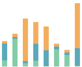
| | - Variation of the column chart
- To represent part-to-whole comparisons of various sub-segments over time or across various categories.
- To determine which sub-total contributes the most to the overall score.
- The column heights are compared to determine the relative frequency of occurrence or relative value of the variable.
- Example: The representation of the types of web-series (thrillers, sci-fi, detective, and so on) watched by people, out of the total viewership, during the lockdown period.
|
| | - Similar to a Stacked Column Chart and a variation of Bar Chart.
- The variables are represented as horizontal bars instead of vertical columns.
- Example: The representation of the revenue generated by various departments like fashion, accessories, electronics, and so on in various supermarkets in a city.
|
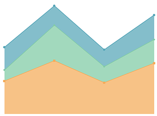
| | - Similar to the Area Chart.
- To represent the evolution of the values of various groups.
- To determine the significance of each group and the evolution of the values of the numerical variable.
- Example: The representation of the revenue generated due to sales of various sub-categories of products in a superstore during a financial year.
|
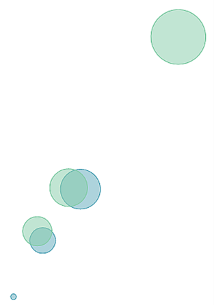
| | - Variation of the Scatter Plot Chart.
- To represent data with three dimensions – x, y, and value (amplitude) of data.
- The size of the bubble (that is, its radius) is proportional to the amplitude of data.
- Example: The representation of the amount of rainfall in various regions of the country during a given period.
|
| | - To create a new table out of a given dataset with the selected variables.
- To highlight that part of the dataset that is used for analysis.
|
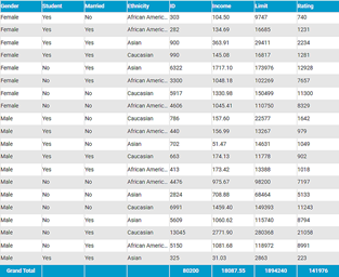
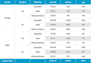
| | - To create a new table out of a given dataset with the selection of rows and columns and the value to be displayed.
- To highlight the correlation between variables that are not represented in the original dataset.
- When there is more than one header row/column then the header row and column are frozen. In case of Single header row/column, header column/row is not frozen.
|
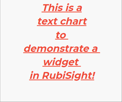
| Text Chart | To create a chart using simple text. |
| | To render custom charts according to HTML code provided by the user. |
| | - To add an image to an existing dashboard.
- Can be browsed directly from the dashboard or using the provided URL.
|
| | - To create a card with a single value related to a single variable.
- To display any important figure related to the given dataset.
|
| | - To observe the relationship between two numerical variables.
- The location of each dot represents the corresponding value of that data point with respect to the horizontal and vertical axes.
- Example: The representation of the sale of raincoats in a city according to the amount of rainfall during a year.
|
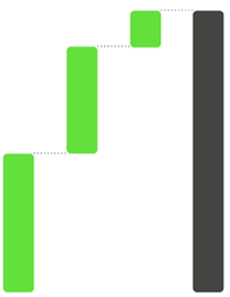
| | - To observe the gradual transition in the value of a variable subjected to an increment or decrement.
- Either the first or the last column indicates the total value of that variable.
- Example: The representation of segregation of the total revenue generated from various home appliances in a shop among the sub-categories of appliances.
|
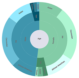
| | - An extension of the Pie Chart.
- To visualize hierarchical data structures.
- Each concentric ring in the outer direction represents a deeper hierarchy in the distribution of data.
- The angle of each segment is proportional to the value of the variable or is divided equally among its parent node.
- Example: The representation of exports of various machine parts, from a company to various countries.
|
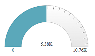
| | - To represent a variable with a filled arc, where it's color and length change with the value of that variable.
- Example: The representation of the customer satisfaction score relating to a product/service.
|
| | |
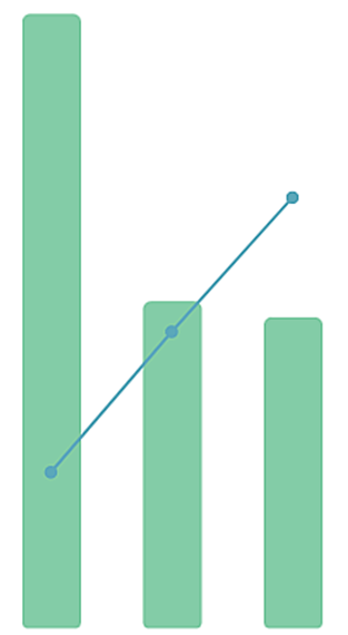
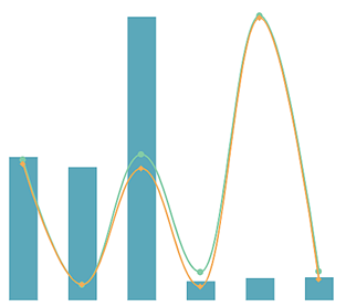
| | - Combination of the features of a Line Chart and a Bar Chart.
- To represent categories of data in the form of lines and bars.
- To validate the relationship between two related variables that have different magnitudes and different scales of measurement.
- Example: The representation of revenue and profit by sale of a commodity in various states in India.
|
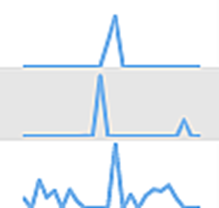
| | - To represent the variation in one variable with respect to another variable or a category.
- Generally used when there are three variables to be represented on the chart.
- If used with just two variables (column and value), a simple table like the chart is plotted without a sparkline.
- To show data trends.
- Example: The representation of the variation in average temperature in a city during months of the year.
|
| | - In general, to represent how a starting 'whole' progressively breaks into individual 'parts.'
- In business or sales context, to track how consumers drop out of the flow or process.
- Example: The representation of the performance of a political party in an election with respect to total seats, prospects, wins, and losses.
|
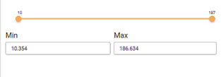
| | - To filter out data for one dimension or one measure.
- To show the minimum and maximum values and the range of values corresponding to a variable.
- It helps represent filtering for interval (date) types of data as well.
- You can save the existing filter conditions when applied through this widget.
- Example: The representation of profit in the sales of a commodity.
|
| | - Variation of the Bar Chart and resembles a thermometer.
- To show a primary variable, compare it with a target variable, and indicate its performance.
- It shows the minimum and maximum values for each dimension that describe the scale.
- Example: The representation of the annual revenue of a company, compare it to the target revenue, and to indicate whether it is good, satisfactory, or bad.
|
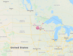
| | - Data values are displayed as markers on Google Map.
- Uses Google Maps API.
- Uses Latitude-Longitude values to display markers.
- Example: The representation of storm data based on location.
|
