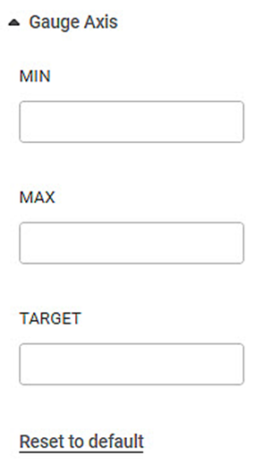
The Gauge Axis formatting option is available in the Solid Gauge Chart.
This allows you to select the Minimum, Maximum, and Target values for the chart.
| These options are visible only if Min/Max/Target are not selected in the Widget Configuration. You can enter custom values here once they appear. |
The table given below describes different fields present for Gauge Chart formatting.
Field | Description | Remark |
|---|---|---|
Minimum | The minimum value to be plotted for the Gauge Chart. | — |
Maximum | The maximum value to be plotted for the Gauge Chart. | — |
Target | The Target value is for comparing how far along the actual value has reached on the scale as compared to the target value. | — |
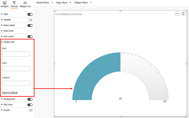
To use Gauge Axis formatting options, first plot a Solid Gauge using the dimensions and measures from the dataset. But do not select Minimum, Maximum, and Target values in the Widget configuration. For example, we plot a Solid Gauge Chart of the Income.
The figure given below shows an original image of the Solid Gauge Chart.
Now,
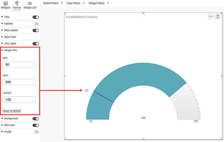
- Enter MIN value
- Enter MAX value
- Enter TARGET value
|
|
The resultant widget is shown below.


