In a data dictionary, you can rearrange or change the order of the features in the newly created dataset using the Hierarchy function. The created hierarchy is used in the RubiSight application.
To use the created hierarchy in a dashboard, follow the steps given below.
- Create a Hierarchy from datasets in the Data Dictionary. Refer to Creating Hierarchy in Rubiscape User Guide.
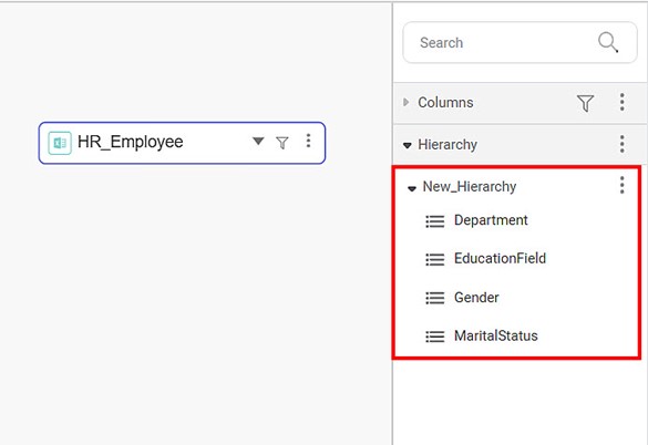
For example, we create a hierarchy named New_Hierarchy using an HR dataset as shown below. The feature sequence in the newly created dataset, i.e., Department, EducationField, Gender, and MaritalStatus, is also shown in the figure below. Thus, the Department is in the first position, EducationField is in the second position, and so on. - Create a dashboard. Make sure to select the Data Dictionary, containing the newly created hierarchy, as a dataset. Refer to Creating a Dashboard.
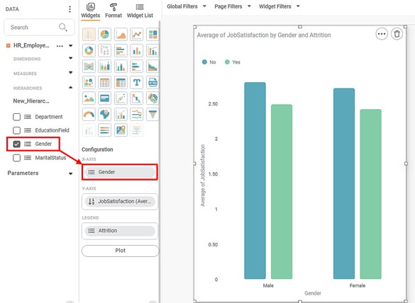
For example, we add DataDictionary_New, containing New_Hierarchy, to the dashboard. - Plot a widget of your choice.
For example, we plot a Column Chart of the Average Job Satisfaction by Gender with Attrition as the Legend. This chart is the default plot. Here, Gender is the feature selected from the newly created hierarchy. You can see that Gender is in the third position in the hierarchy. - Save the dashboard and click View Mode in the top-right corner. You can now see the widget in the View Mode.
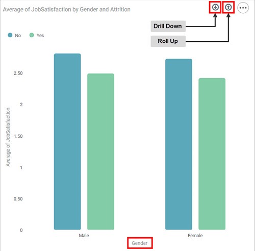
- Two CTA arrows (Call To Action arrows) appear on the top right corner of the widget. These are
- Drill Down ()
- Roll Up (
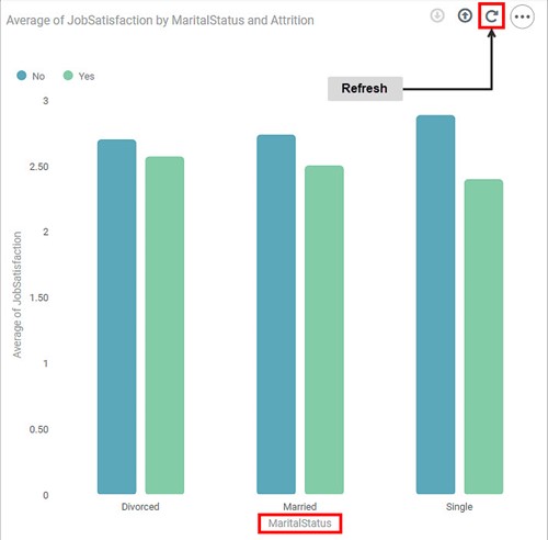
To use the hierarchy, click any of the two CTA arrows. For example, we click the Drill Down CTA arrow. You can see that
- The feature on the X-axis changes to MaritalStatus, and the graph gets replotted.
- A Refresh arrow appears next to the Roll Up arrow. You see the default widget with Gender on the X-axis if you click Refresh.
- The Drill Down CTA arrow gets disabled since MaritalStatus is the last feature in the hierarchy.
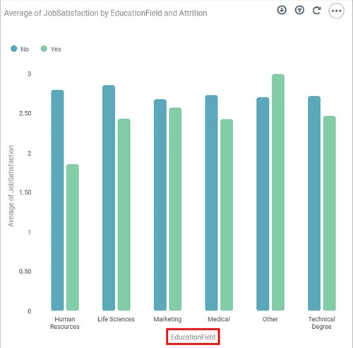
Starting from the Column Chart with Gender on the X-axis, click the Roll Up CTA arrow. You can see that
- The feature on the X-axis changes to EducationField, and the graph gets replotted.
- A Refresh arrow appears next to the Roll Up arrow. You see the default widget with Gender on the X-axis if you click Refresh.
- None of the CTA arrows gets disabled since EducationField is neither the hierarchy's first nor the last feature.
Notes: |
|
