Data Visualization
Data visualization is the representation of data in the form of pictures, images, graphs, or any other form of visual illustration. It allows decision-makers in organizations to understand data analytics visually. This makes it easy for the user to understand the complex concepts and identify new patterns easily.
Data visualization is both an art as well as a science. It involves a systematic alignment between graphical symbols and data values. This determines the visual representation of data. In other words, it represents the variation in data values with the help of the variation in the size and color of graphical symbols.
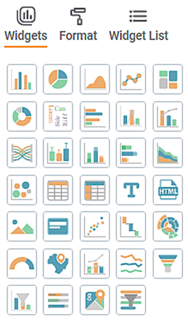
In RubiSight, charts are referred to as widgets. They are available in the widgets pane.
Dashboard
A dashboard is a Graphical User Interface (GUI), which displays all the key performance indicators at a glance. In short, it is a progress report generated to gauge the performance of a process, business, and so on.
In Rubiscape, a dashboard is an interactive platform hosted in RubiSight, where the insights and outcomes of a successfully run model are displayed.
RubiSight
RubiSight is a visual data storytelling dashboard with simple drag-and-drop functionality. Once the model is ready, it can be displayed on the dashboard in RubiSight.
RubiSight is a cloud-powered visual data exploration experience. It enables business users to achieve faster dashboard turnaround and provides flexibility in tapping data in any subject area (without the knowledge of coding) or any specific technical skills.
The figure given below is the widget pane from which a suitable widget can be selected for representing your data effectively.
Table of Contents
