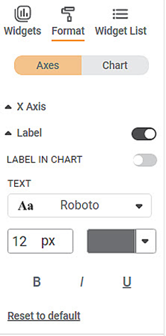
This formatting option allows you to make the following changes to the Axis Label.
- You can change the text font and also its size and color.
- You can make the text bold, italic, and underline it.
Axis Label is the parameter that represents the variable that you plot on the X-axis.
This formatting option allows you to make the following changes to the Axis Label.
- You can change the text font and also its size and color.
- You can make the text bold, italic, and underline it.
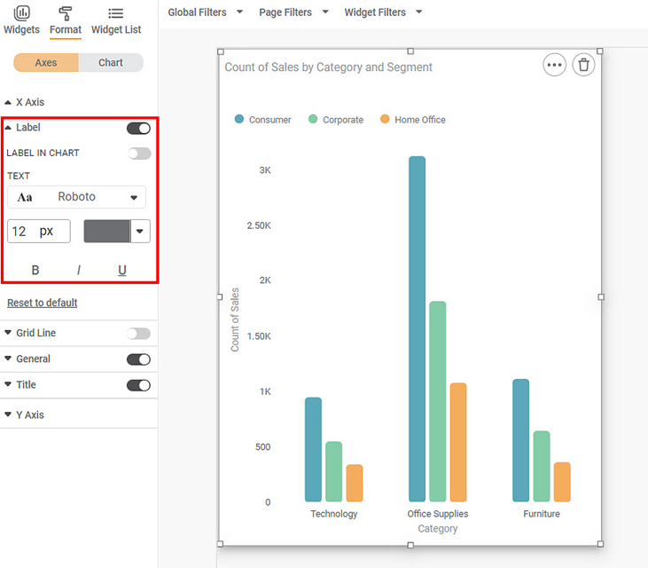
To use axis label in formatting option first plot a column chart. Column chart is plotted by using the dimensions and measures from the dataset. For example we plot a column chart of the count of sales against the categories. The Segment of the sample is the Legend dimension.
The figure given below shows an original image of the Column Chart. By default, the font used is Roboto, and the font size is 12.
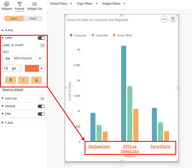
Now, change the
- Font type and size
- Font Color
- Make the title bold, italic, and underlined
The resultant widget is shown below.
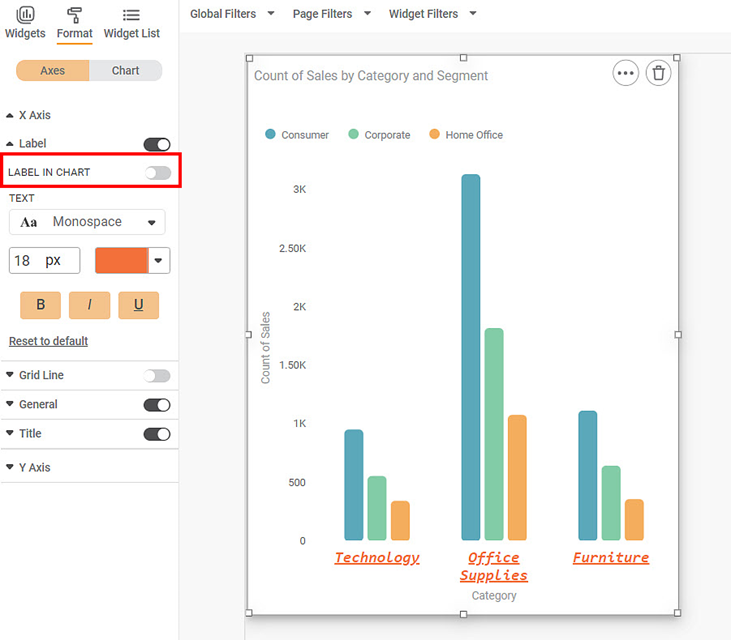
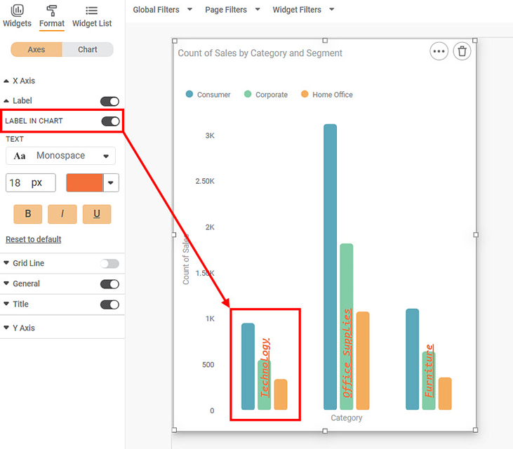
To use the ‘label in chart’ option, select a Widget. After toggling the 'label in the widget' option, the 'labels' of a Widget are pushed into the chart.
Label in chart option applies to Column charts, bar charts, Stacked-column, Stacked-bar, Pareto charts, and Combination charts.
Now toggle on the ‘Label on chart’ option.
Now the label can be seen inside the charts.
