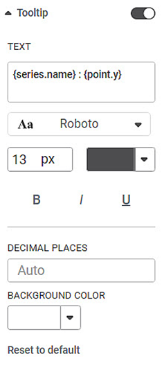
Tooltip is the message that is displayed when you hover over the widget. Tooltip helps us to add any additional important information to the widget.
By default, the tooltip formatting options are not visible. Click the toggle button () to format the tooltip.
The table given below describes different fields present on Tooltip formatting.
Field | Description | Remark |
|---|---|---|
Text | It allows you to type the text that is used as the tooltip. |
|
Decimal Places | It allows you to select the number of decimal places up to which you want any variable value to be displayed. | By default, the calculated value is displayed in the tooltip. This value can be up to any number of decimal places. |
Background Color | It allows you to select a suitable color for the background of the tooltip. | — |
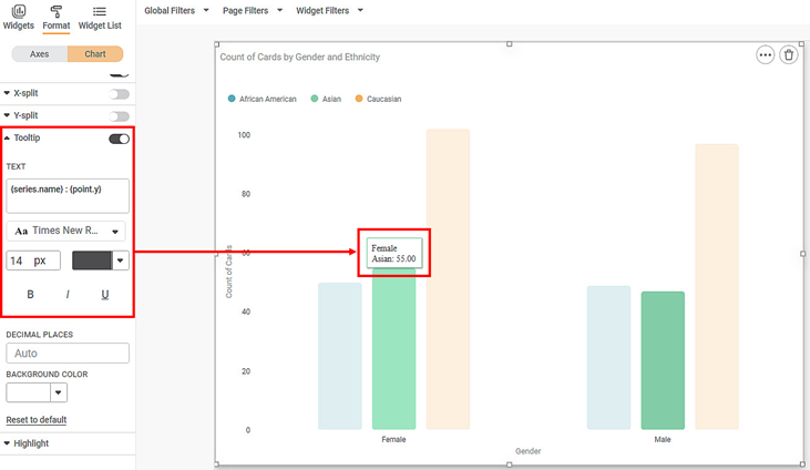
To use Tooltip formatting options, first plot a Column Chart using the dimensions and measures from the dataset. For example, we plot a Column Chart of the Count of Cards against Gender. The Ethnicity of the sample is the Legend dimension.
The figure given below shows an original image of the Column Chart. By default,
- There is no background image for the plotted chart.
- The background color is the color of the canvas.
- The plot area is not bordered.
Now,
- Change the tooltip font type, font size, font color.
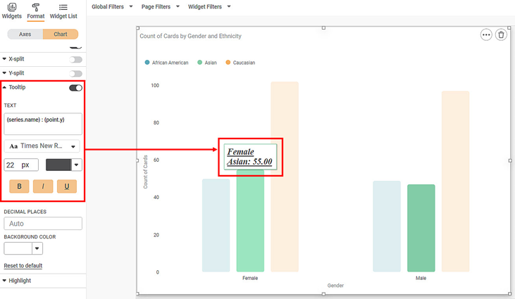
- Make the tooltip bold, italics, and underline it.
The resultant widget is shown below.
Now,
- Change the color of the tooltip text font.
- Change the number of decimal places up to which you want to display the values.
- Change the background color of the tooltip.
The resultant widget is shown below.


