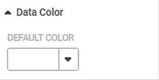
Data Color formatting option allows you to select the color of the data displayed on the chart.
The table given below describes different fields present on Data Color formatting.
Field | Description | Remark |
|---|---|---|
Default Color | It allows you to select the color of the widgets. |
|
This option is available in almost all charts. In this example, we are using a Column Chart.
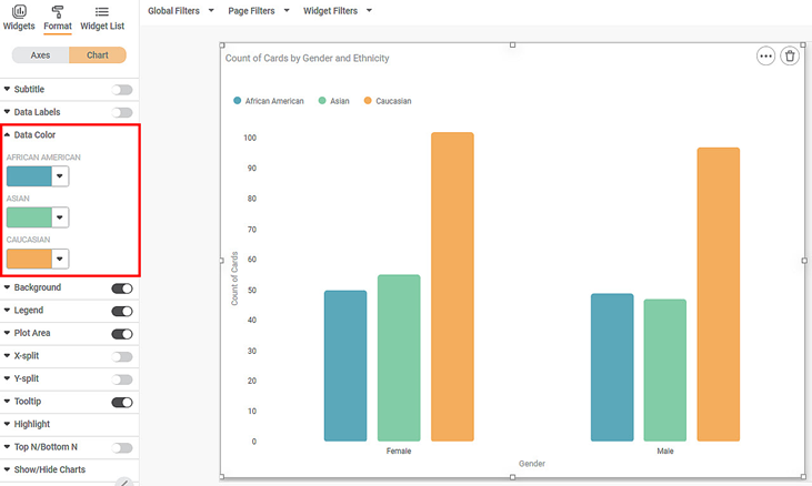
To use the Data Color formatting option, first plot a Column Chart using the dimensions and measures from the dataset. For example, we plot a Column Chart of the Count of Cards against Gender. The Ethnicity of the sample is the Legend dimension.
The figure given below shows an original image of the Column Chart. By default, the data colors are selected in the Trevilla theme. The number of colors used depends upon the number of legends in the chart.
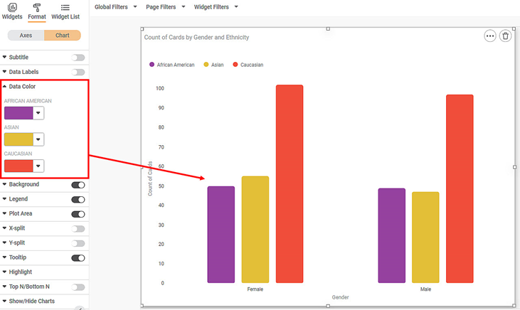
Now change each data color individually. The resultant widget is shown below.


