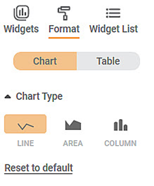
The figure below shows the formatting fields in the chart type dropdown.
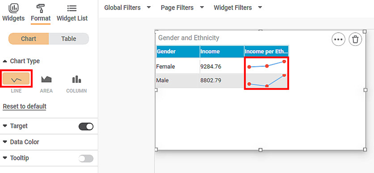
To use Chart Type formatting options, first plot a Sparkline Chart using the dimensions and measures from the dataset. For example, we plot a Sparkline Chart of Ethnicity against Gender.
The figure given below shows an original image of the Sparkline Chart. By default, the Chart Type is Line.
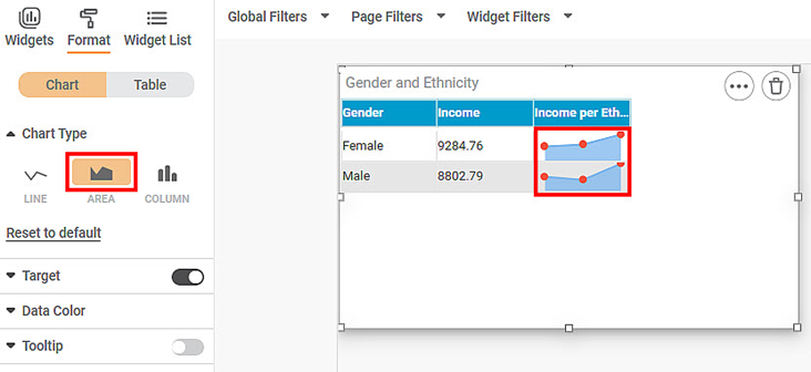
Now, change the Chart Type to AREA.
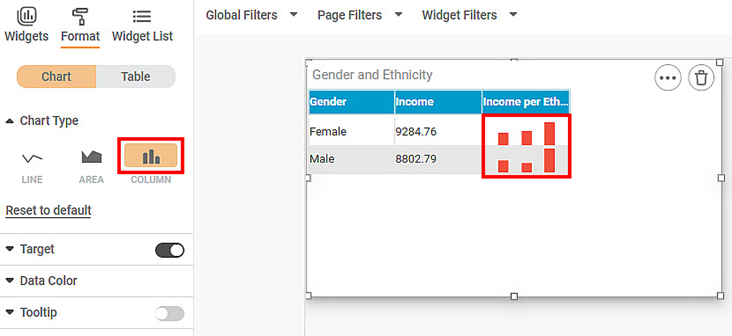
Now, change the Chart Type to COLUMN.


