The Category formatting option is available in the Card widget. You can use this option to change the appearance of data on the chart.
By default, the Category formatting options are not visible. Turn the toggle button ON () to use the Category formatting options.
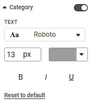
The table given below describes different fields present in Category formatting.
Field | Description | Remark |
|---|---|---|
Text | It allows you to change the appearance of the data label Text. |
|
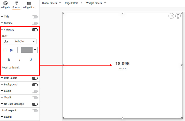
To use Category formatting options, first plot a Card chart using the measures from the dataset. For example, we plot a Card Chart of Income.
The figure given below shows an original image of the Card Chart.
Now,
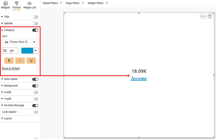
- Change the Category text font type, font size, and font color.
- Make the text bold, italic, and underline it.
The resultant widget is shown below.


