To create a chart using widgets, follow the steps given below.

  1. Open the Dashboard in edit mode. Refer to Editing a Dashboard.
    The Dashboard is displayed.
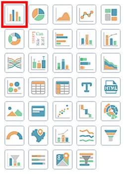
  2. In the WIDGETS pane, click the widget you want to use.

    (info) Note:

    Hover over any widget to see its name and the number of dimensions and measures required to plot it.

    The selected widget is added to the dashboard canvas.

  3. Select the widget added on the dashboard canvas. For example, here we consider a Column Chart.
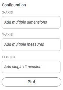
    The corresponding Configuration settings are displayed in the WIDGETS pane.

    (info) 

    Notes:

    • The Configuration setting varies depending upon the selected chart.
    • You can add multiple widgets on one canvas.


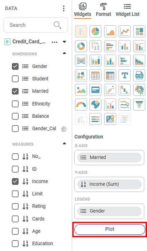
  4. From the DATA pane, drag-and-drop the DIMENSIONS and MEASURES in the appropriate Configuration fields, and then click Plot
    For example, here we drag-and-drop Gender in X-AxisAverage Income in Y-Axis, and Married in Legend.

    (info)Note:You can add new columns to your dashboard by Adding Calculated Column to Dashboard.


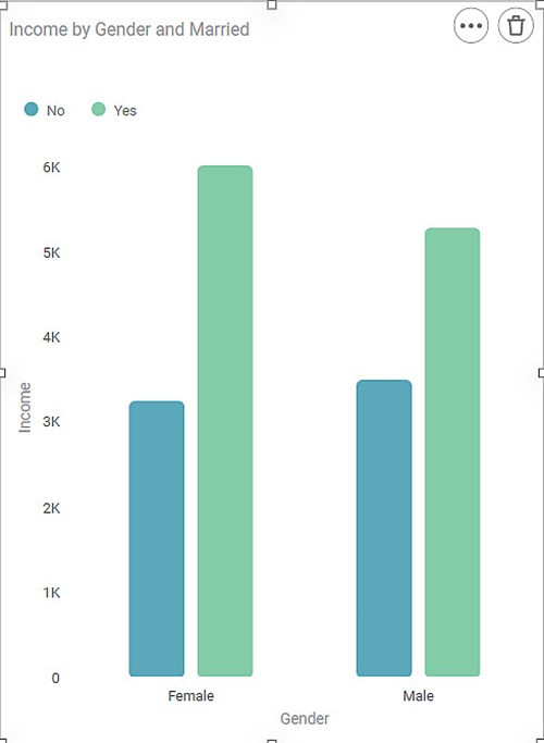
    The chart is plotted depending upon the dimensions and measures added in the configuration.


(info) Notes:
  • To add a new page, click () on the Dashboard Page bar.
  • For more options, click () on the Dashboard Page bar. The available options are,
    • Duplicate
    • Delete
    • Rename
    • Move Right
    • Move Left
  • Once the dashboard page is deleted, it is permanently erased.
  • You can format the chart using the FORMAT option in the widget pane. Refer to Formatting a Widget.
  • While configuring a widget, when you plot a measure type variable, you are provided with the option of changing its aggregation method.
  • The various aggregation methods in RubiSight are listed below.
    • Count
    • Count (Distinct)
    • Sum (default)
    • Maximum
    • Minimum
    • Average   
  • Apart from the Aggregation methods mentioned above, you can also choose to display the values as Percentage in the widget.
  • To change the aggregation method, hover over the value, and click the gear icon (). Select the required method from the list.
  • After you make any changes to fields or parameters, click Plot to apply those changes to the chart.