In RubiSight, you can create a map widget if your dataset contains geographical variables.
Geographical Variable
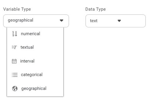
In RubiSight, a new variable type called geographical is added to represent a location. It is supported for the below-listed location identifiers.
- Region
- State
- Country
- Continent
- Subcontinent
The geographical variable is denoted by the earth symbol (), and its Data Type is Text.
To create a dataset containing Geographical variable type, refer to Creating a Dataset with Geographical Variable Type.
|
|
Creating a Map Widget using Geographical Variable
In RubiSight, a geographical variable type is used to represent the location type of features on Map widgets.
To add a dataset containing a geographical variable type column and plot a Map Widget, refer to Creating Visualization using Widgets on Dashboard.
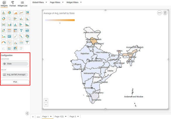
In the following example, we create a Map widget using the Rainfall in India In February 2023 dataset. In the dataset, the Location column contains the names of Indian states/regions and union territories, which are geographical variables.
We plot the data for the Average Rainfall by States.
|
|
Scenario 1:
In datasets containing regions from India, you can view different maps –
- India with Disputed Territories
- India with Andaman and Nicobar
For example, the map plotted in the figure is of India with Disputed Territories.
To change the map, follow the steps given below.
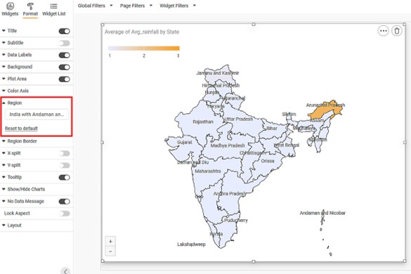
- In the widget pane, click Format.
The Map Widget formatting options are displayed in the pane. - Click the Region drop-down.
- Type the name of the map that you want to view. Partial text is also allowed.
In the example, we select India with Andaman and Nicobar.
The map is changed to India with Andaman and Nicobar.
| In this map, you can see,
|
Scenario 2:
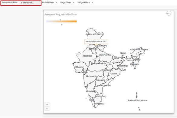
In View Mode, you can apply the interactivity filter by selecting a region. In this case, only the selected region is highlighted, and other regions are disabled.
In the example, when you click Himachal Pradesh, you see that the region is highlighted and the Average number of Rainfall is displayed in it.
At this time, all other regions are disabled.


